Breakfast
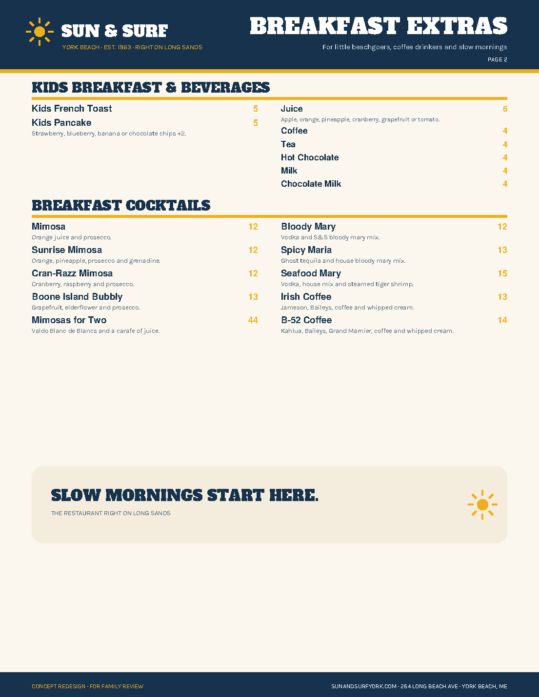
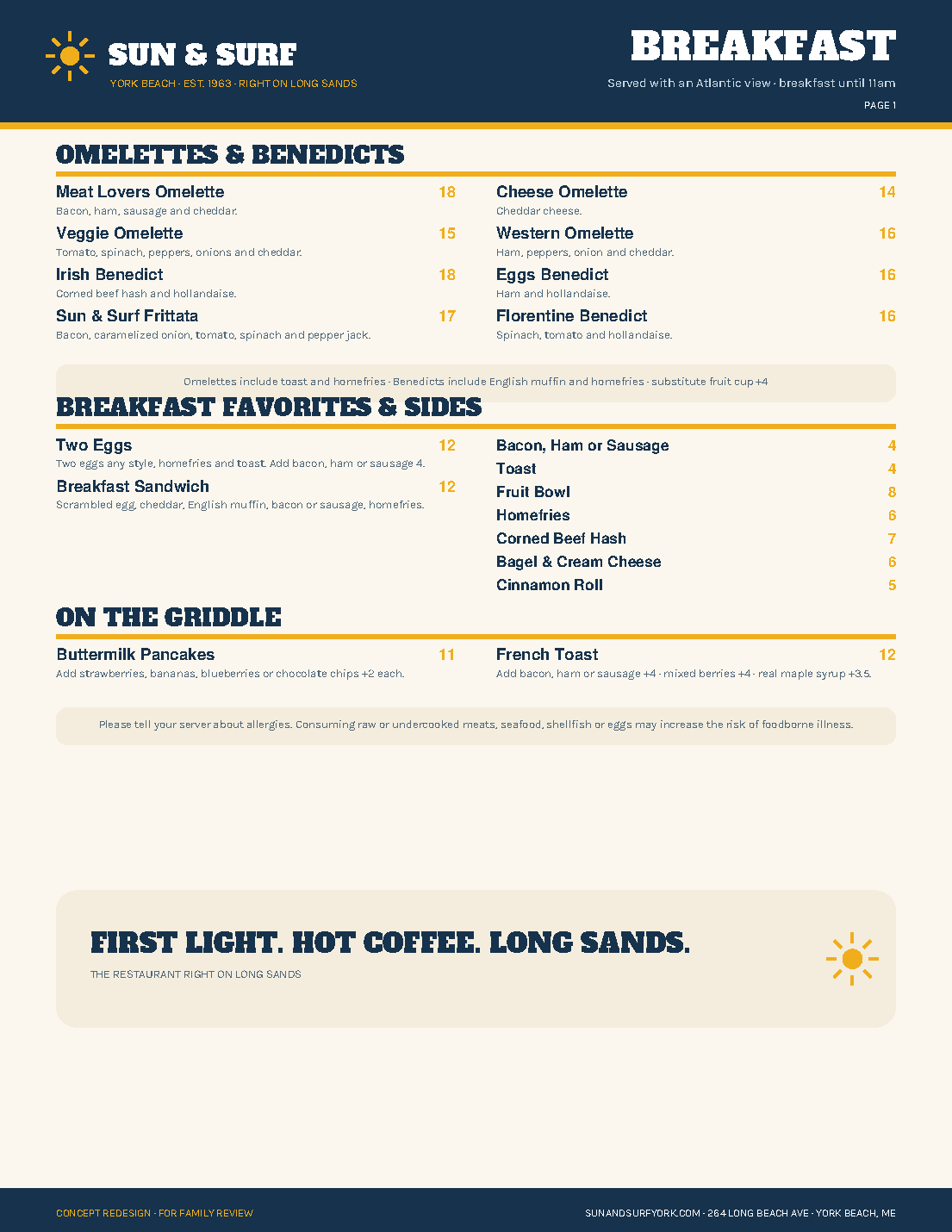
Two pages with a calm morning hierarchy: omelettes, favorites, griddle, kids, drinks, and breakfast cocktails.
Open PDFThe current content, rebuilt with faster scanning, stronger price hierarchy, printer-safe pages, and the same nostalgic Maine identity as the website concept.
Four unrelated visual styles became one coherent system: Atlantic navy, sun gold, warm paper, slab-serif headings, clear category bars, aligned prices, and restrained descriptions. The lunch pages no longer place art over copy, the cocktail list is easier to scan, and the kids menu finally feels like part of Sun & Surf.
Two pages with a calm morning hierarchy: omelettes, favorites, griddle, kids, drinks, and breakfast cocktails.
Open PDF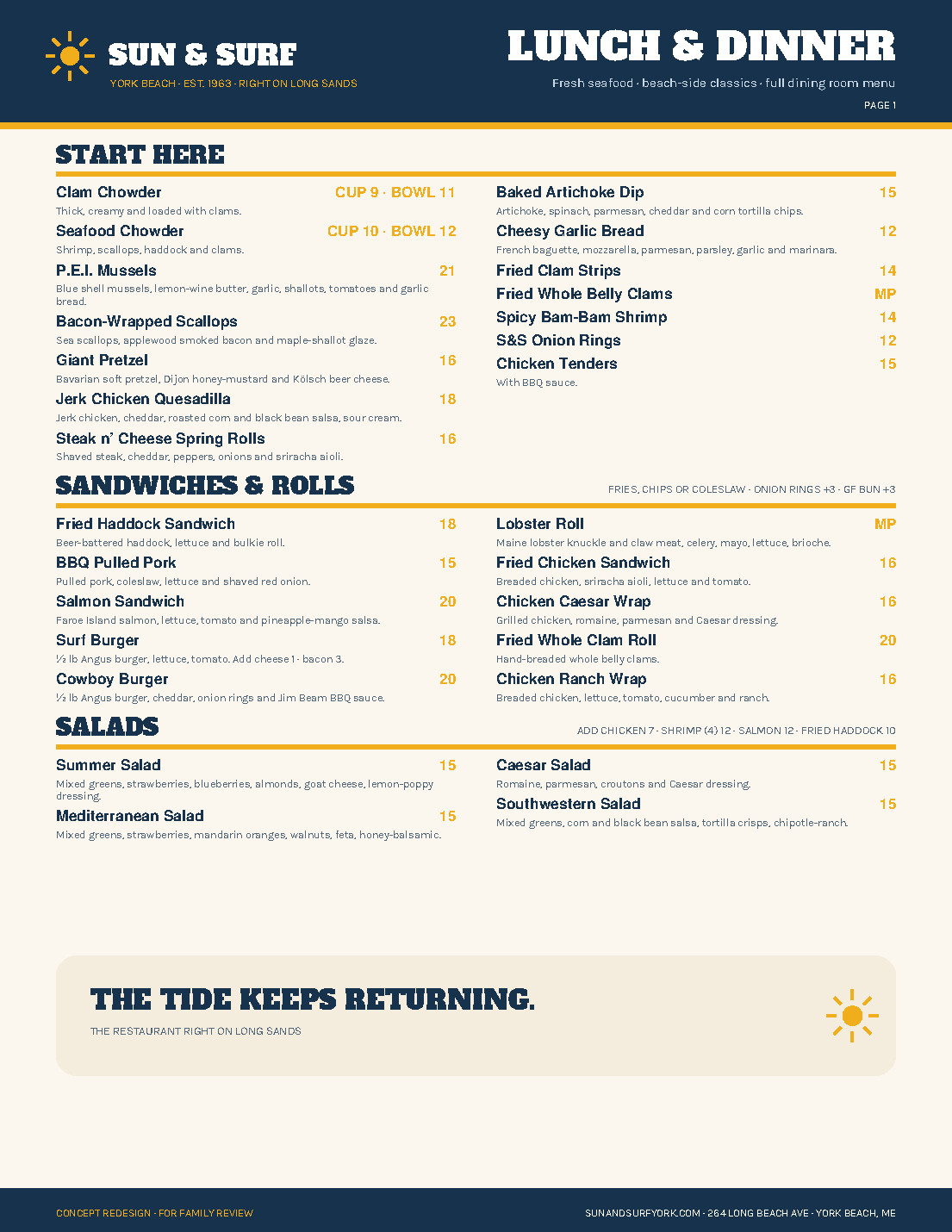
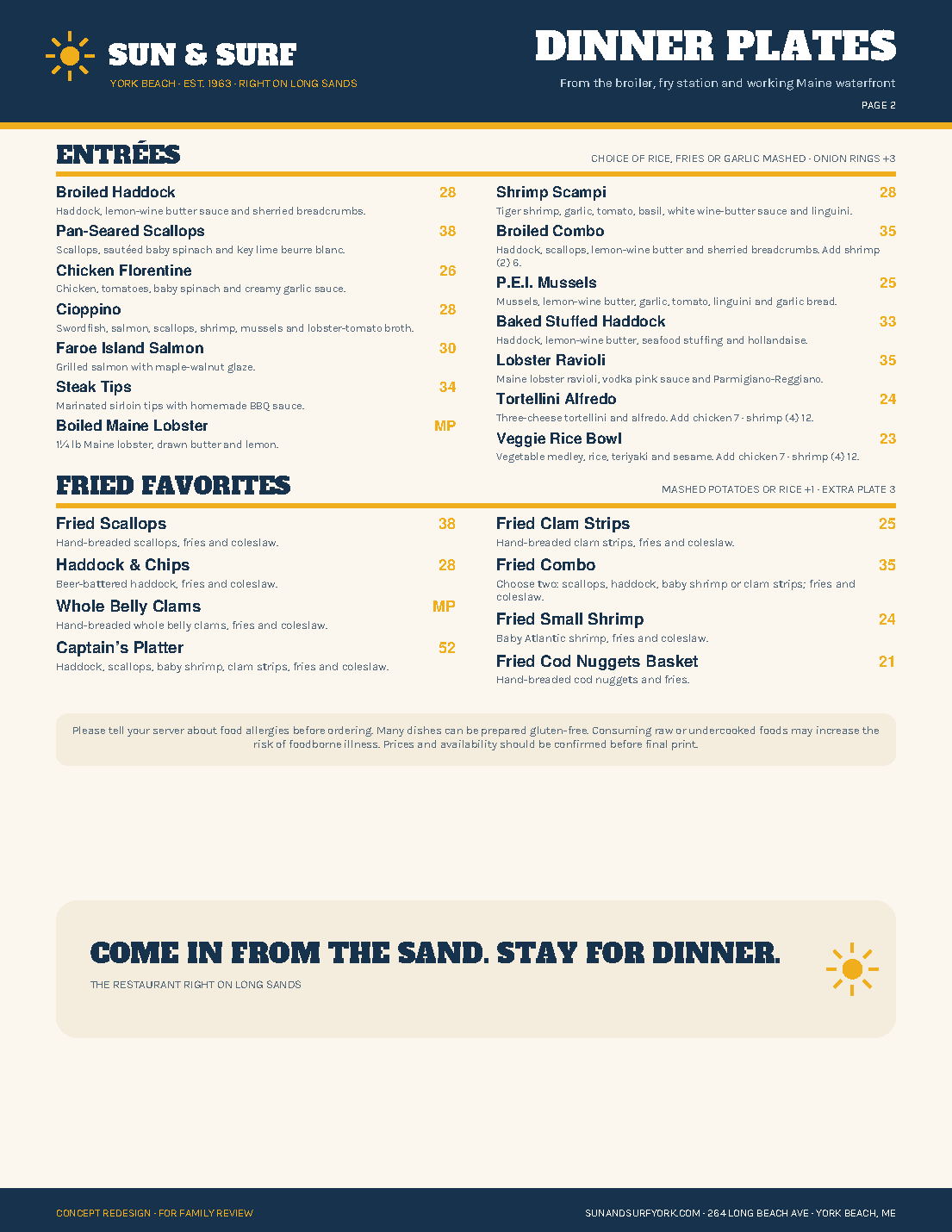
Two pages organized around the actual decision path: starters, rolls, salads, dinner plates, and fried favorites.
Open PDF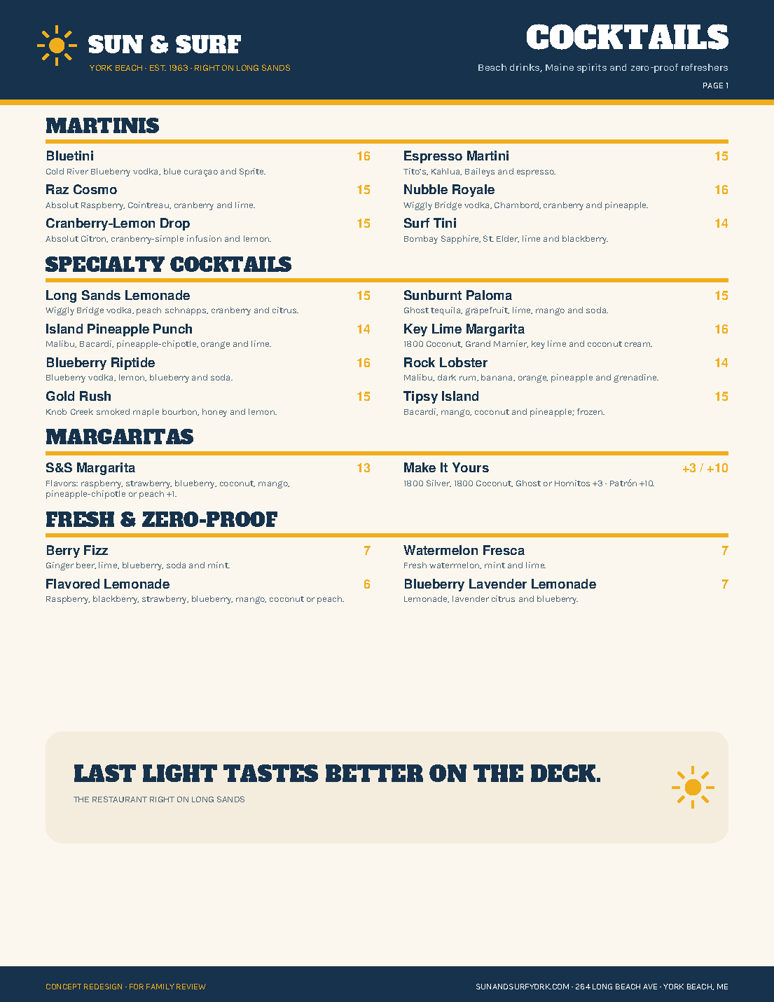
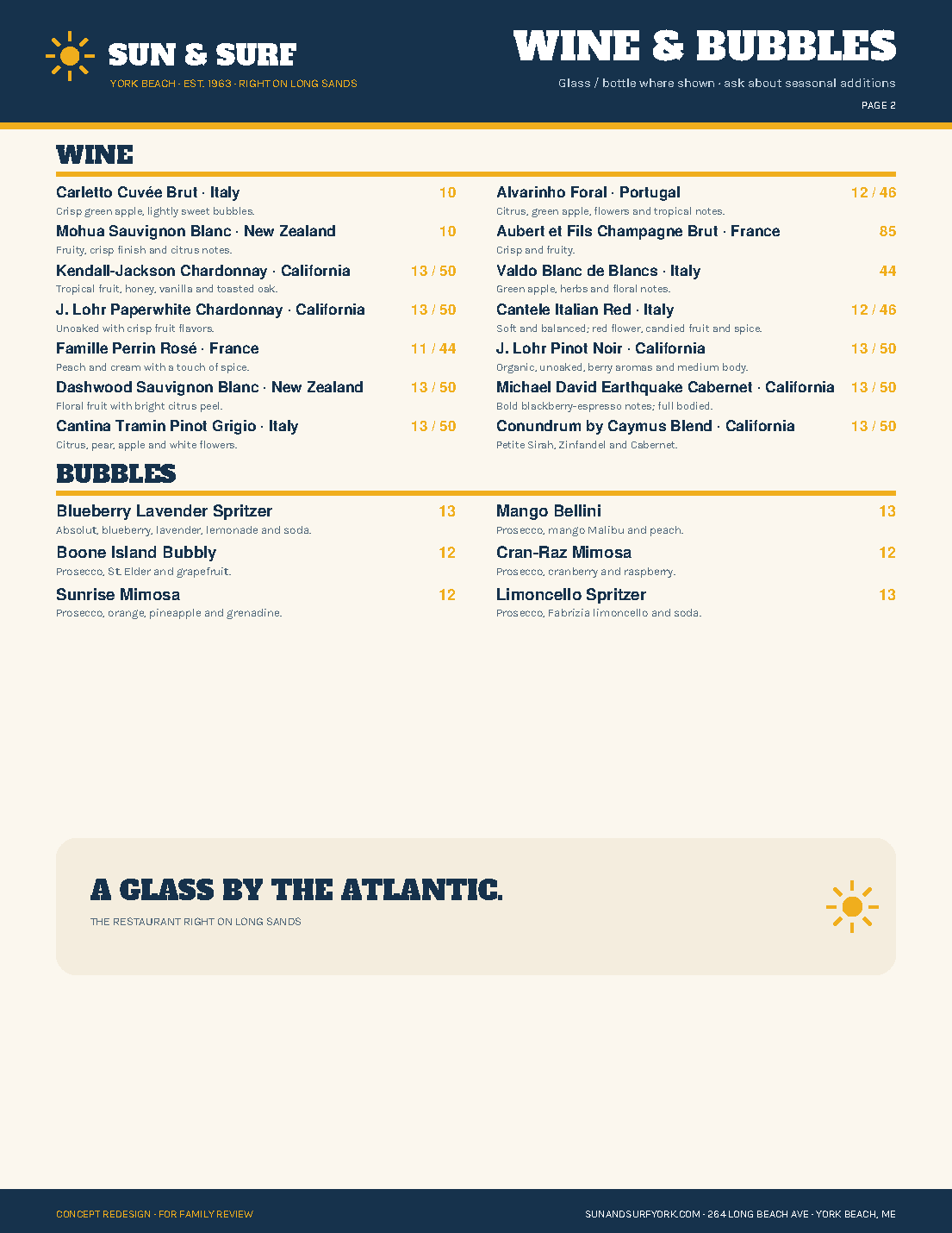
Signature drinks, margaritas, zero-proof choices, wine, and bubbles in one consistent, legible system.
Open PDF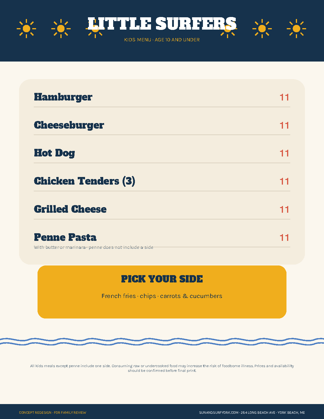
Simple enough for a child to scan, clear enough for a parent, and unmistakably part of the same restaurant.
Open PDF